Hello. It’s not often I get to write about my own work...
I had a small show recently in the Bridewell Gallery, which was initially supposed to be for one day only but ended up lasting a week. I wasn’t certain even the day before that it would happen, as I had injured my back and could barely walk. One piece was shelved as it involved me walking to make it and I had to rely on others to carry the paintings from the studio to the gallery. There were only three paintings and over the whole week, footfall was in single digits, so why did I bother?
I grew up in a village. We moved there from a town in autumn 1975. Events were based around the church and it’s various festivals or the village hall and it’s interest groups; Book club, Art club, flower arrangers and growers of outsized vegetables. The village had it’s eccentrics, the unintelligible drunk who regularly slept in a ditch, the ghostly Victorian lady who lived in a tiny cottage, hidden by ivy and whose widows weeds covered her from her veiled face to beyond her feet, giving the impression that she floated as she moved and the penniless ‘Lord’ of the Manor who had squandered his wealth way back when, in casinos and bookies and whose house was falling down around him.
There were many pensioners living there, all of whom had experienced life during the Second World War and some who had experience of the first. WW1 began sixty-one years before we moved to the village. This meant that anyone sixty-six and upwards would remember something about it and would have been affected by it. Any male seventy-five and upwards may well have fought in it as boys lied about their age to enlist and the authorities did very little to discourage this. Ninety-eight served. Fifteen didn’t return. Today the village has a population of seven hundred and I imagine that hasn’t changed very much since 1914. The impact of this mechanised carnage was huge on this village and every other village, town and city in the land.
The memorial was in the middle of the village with the names of those who served and died carved into stone. There were repetitions of family names. One of my friends, had a representation of five of his family, another had four. What had seemed like a great adventure to many volunteers soon became a nightmare and those that returned were changed forever. At secondary school we studied the war poets and as my knowledge of the subject grew, so did my anger at the pointlessness of it all. It was always difficult to watch the survivors, Harry Patch and the other centenarians break down before the cameras, remembering something that happened eighty years before; men who lived long lives and suffered for their longevity. Harry Patch, the last survivor who experienced the trenches, died in 2009 ages 111.
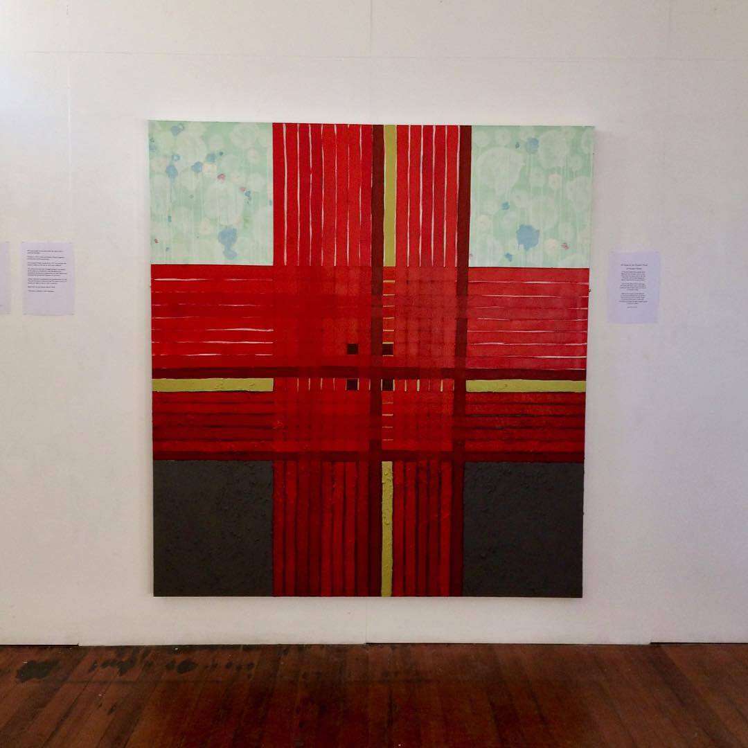
‘All Quiet on the Western Front - in Flanders Fields’
So what is the relevance of this back-story? Well, I felt that it was important for me personally, maybe as some kind of exorcism, to mark the Centenary of the Armistice. I ended up hanging three paintings - two from a recent exhibition and a third new one. The new one, ‘All Quiet on the Western Front - In Flanders Fields’, was based on the poem ‘In Flanders Fields’. It references the rows of crosses and poppies between and the rows of a ploughed field. The rhyme scheme is reflected by the change of reds used for the rows, one of which is a chlorine gas green separating the first nine lines from the last six. I used soil mixed with the paint for the bottom half of the work as the majority of my paintings are tied to the landscape in some way and to reference the mud bath that was the trenches. The top half is a lighter ephemeral space.

Detail from ‘All Quiet on the Western Front - Flanders Fields’
The second painting was ‘Elysian Fields’. Again, the landscape influences the composition with rectangular field shapes interlocking and a break between land and sky. The autumnal colours are a simple metaphor for the end of the day/life. I felt the relevance of the Elysian Fields as a place where the Greeks believed their heroes would spend eternity fitted with the theme of the exhibition.

‘Elysian Fields’
Finally, I included ‘Islands’ as an antidote to the other two as it is about communicating. Two flag-like shapes interact amongst a starry universe, if they don’t then they are just lonely islands in the emptiness. It is an anti-Brexit, anti-isolation, anti war painting. It is about love.

‘Islands’
One last thought. Many people refer to my paintings as abstract, I don’t mind at all. But they aren’t. They all have a narrative and a reference the real world and I suppose if I had to pigeonhole them I would say they are landscapes. It’s good to talk....
Text by Ian Fallace
Images by Fiona Filby